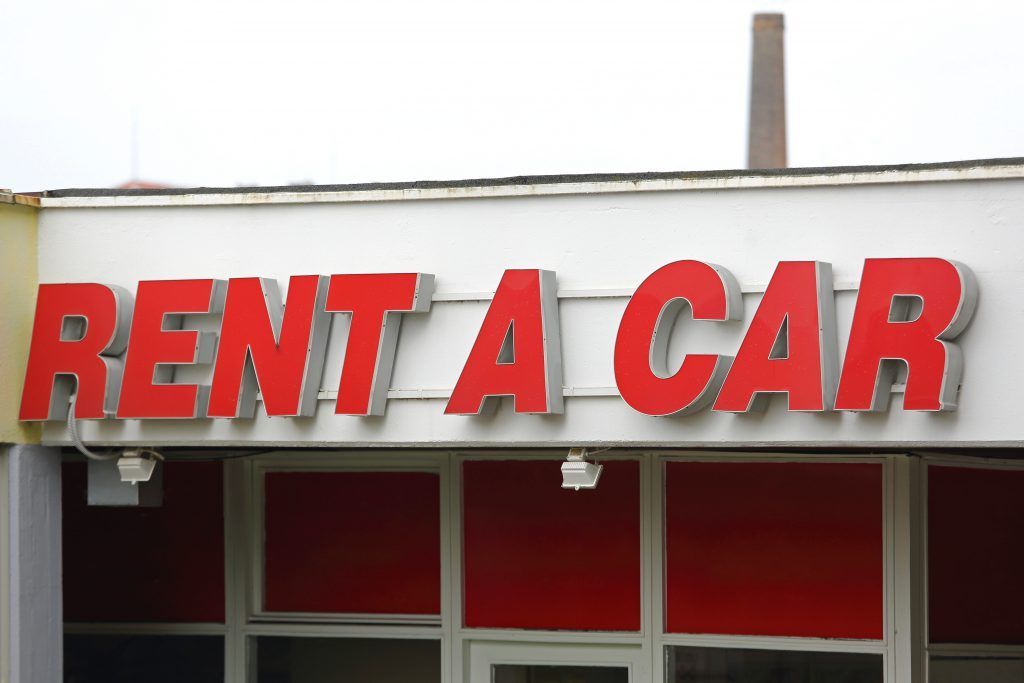
On-premise signage is the most effective and least expensive form of advertising that you can use to promote your business. In fact, it can be responsible for at least half of the customers that visit your store hence your sign must be easy to read and understand, attractive and memorable.
Here are some helpful tips on how to improve your lettering for successful signage.
- Use Dimensional Sign Letters
Although a book is not judged by its cover as the old saying goes, potential customers actually judge your business by the signage. Customers relate boring signs and poorly-maintained and unprofessionally designed signs to the quality of the products and services you offer. A great way to give your business or company a professional look and to make it stand out is to use dimensional sign letters.
These cut, 3D lettering will make your business sign pop by perfectly reflecting your business’s image and branding. Bronze and brass lettering, for instance, depicts polish and professionalism to a business or shopping plaza. Aluminium and stainless steel lettering will give your business a clean and modern look. Unlike flat signage, dimensional sign letters literally stand out from the competition.
- Use Channel Letters
These signs can be your best business investment when it comes to successful business signage. Channel letters are three-dimensional letters that feature an easy to read and simple font and are also internally lit. Although this design may seem simple, it’s an extremely effective form of advertising that gives your business a professional appearance. These type of signs can open up several possibilities that the standard two-dimensional letters cannot.
- Use Upper and Lowercase Letters
There is a common misconception that using all caps for your sign lettering makes reading easier, but this isn’t necessarily the case. In fact, capital letters should be avoided except for sign headings. It’s advisable to combine both upper and lowercase letters since using all caps is like yelling to your customers which may be considered rude.
When designing your sign letters, it’s important to have your audience in mind. Consider the following factors:
- The amount of text to be read.
- Whether the audience will read the sign while standing or driving past it.
- Whether the audience needs an easy to read font or novelty fonts will do.
- Use Vinyl Lettering
These are letters, numbers or graphics that are cut out individually from a vinyl sheet and pre-spaced before being placed onto a pre-masked transfer tape. These letters are durable and weatherproof and can be used to apply business hours, brand or any other information to your doors, windows or walls. They give your business a premium and professional look.
Contact us at Genesis Signs for more tips on how to improve your lettering for successful signage. We will help you choose the best sign lettering design for your business.


