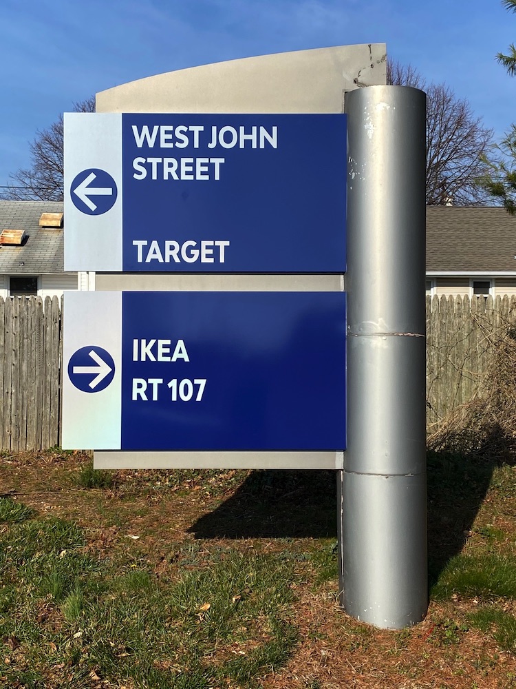
Visitors to a large corporate complex can become confused and frustrated quickly if they can’t find the information they need or if the complex’s directories are disorganized and confusing. This can reflect poorly on the company itself, not to mention make visitors feel unwelcome and uncomfortable, resulting in them choosing not to return in the future. That’s why it’s important to ensure that your corporate directory system and its corresponding corporate signage are coordinated properly.
Design Directories to be Visible and Easy to Follow
Design your directories so that your visitors know where they are and where they’re going. Visibility is key here — you can even highlight directory colors on wayfinding signage or include floor plans with your directories. The added benefit of directory visibility is that your visitors will feel secure, making them less likely to get lost in an unfamiliar building. Color-coding directories by department is another great way to keep guests on track.

Create a Strategic Signage Plan
Some companies go all out when it comes to signage, while others barely have any at all. But even if you’re not creating an intricate master plan with multiple design schemes and color-coding levels, it’s worth taking some time to create a strategic plan. How do you want your visitors (customers or employees) to move around your building? Where will they park? Which rooms are most important—and should have higher visibility? These are all questions you will want to consider for your particular place of business.
Be Wary of Cheap Signs That Will Need Replacing Soon
It’s important to choose a sign that will stand up to both daily wear and tear as well as weather. Remember, cheap is expensive! If you end up replacing signs often because they break or get worn down, your money will go much further if you invest in higher-quality signage from the beginning.
Choose Consistent Fonts & Font Sizes
If you want your directories and signs to look professional, they need to be consistent. The easiest way to accomplish that is by using consistent fonts and font sizes. Try picking a standard font (Arial or Times New Roman are two good choices) and sticking with it on all signage. You should also pick one font size that works well for all of your needs; typically, 12-point fonts work well in most cases.


